Using Component Libraries in Primo
You can build more quickly in Primo by utilizing external component libraries meant to work with Svelte or HTML/CSS. Since you don't have to npm install in Primo, you can use most component libraries by importing the library or individual component in your Block's JS and mounting it from your Block's HTML. Workarounds are necessary in some cases to get certain libraries to import correctly. By importing components individually, you can also cherry pick components from different systems.
Carbon Design System
- Use Carbon Components Svelte
- Import components from your Block's JS as direct imports (see the full list of components) rather than named imports. Mount them in your HTML.
- Link the stylesheet from your Block's HTML.
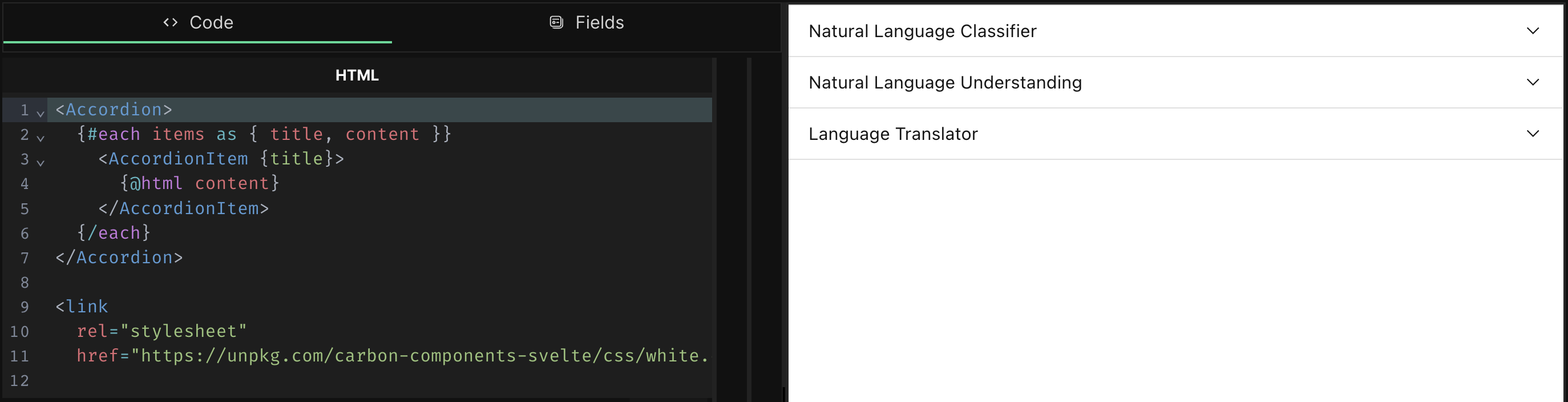
Example (Accordion)
Here we're importing the Accordion and AccordionItem components and creating a repeater field to create content for each accordion item.
HTML
<Accordion>
  {#each items as { title, content }}
    <AccordionItem {title}>
      {@html content}
    </AccordionItem>
  {/each}
</Accordion>

<link
  rel="stylesheet"
  href="https://unpkg.com/carbon-components-svelte/css/white.css" />
JS
import Accordion from "carbon-components-svelte/src/Accordion/Accordion.svelte";
import AccordionItem from "carbon-components-svelte/src/Accordion/AccordionItem.svelte";
Fields
Repeater -> Title (text), Content (markdown)
Shoelace
The autoloader doesn't work, but you can import components individually (see the 'installing' section at the bottom of any component's page for a CDN url).
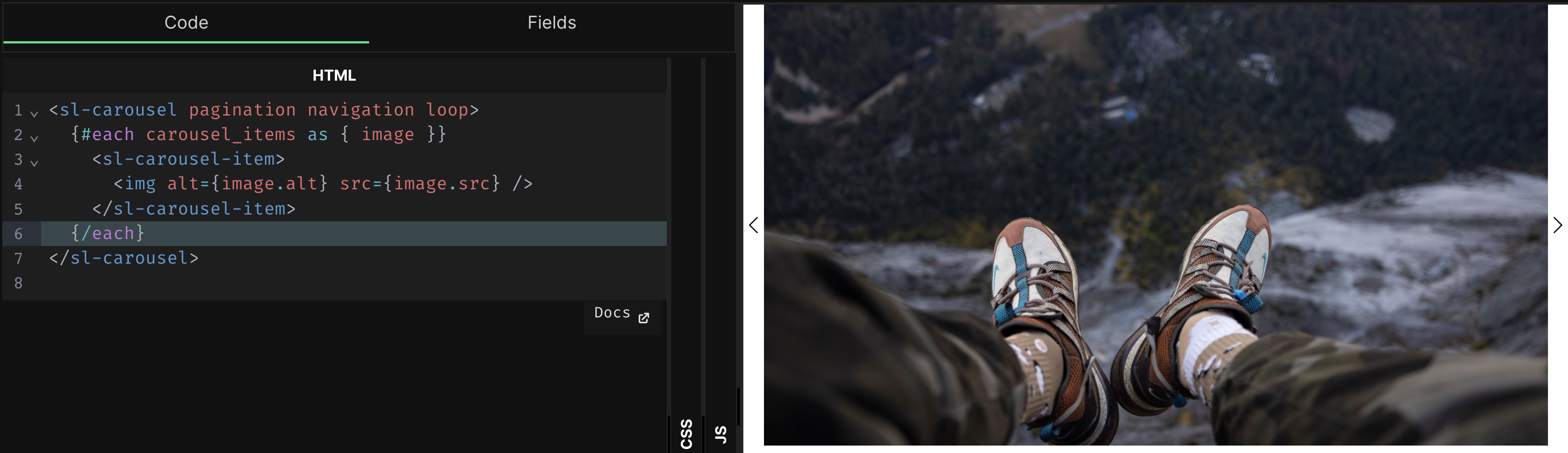
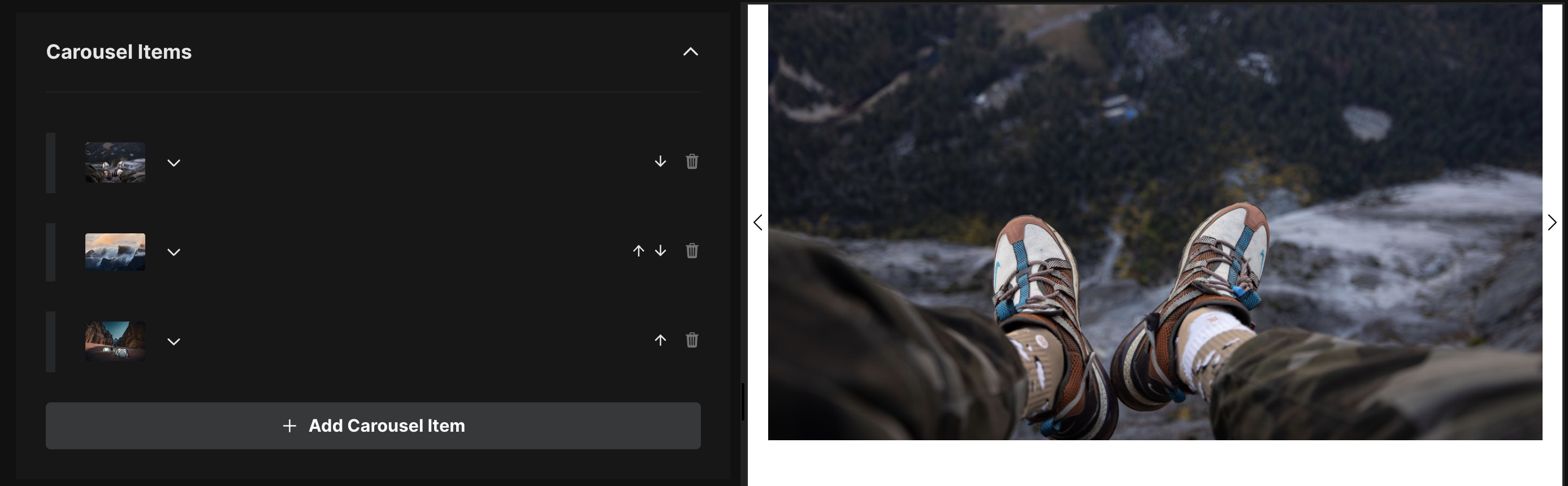
Example (Carousel)
Here we're importing the Carousel component and setting up a repeater field for each carousel item containing an image field type.
HTML
<div class="section-container">
  <sl-carousel pagination navigation loop>
    {#each carousel_items as { image }}
      <sl-carousel-item>
        <img alt={image.alt} src={image.src} />
      </sl-carousel-item>
    {/each}
  </sl-carousel>
</div>
JS
import 'https://cdn.jsdelivr.net/npm/@shoelace-style/shoelace@2.8.0/cdn/components/carousel/carousel.js';
Flowbite
Flowbite is a Tailwind CSS library, and Flowbite Svelte is its Svelte version. It requires adding Tailwind using its JS Play CDN (meaning it needs to load the library in the client before it can render the utility class styles), but for most projects this won't be an issue.
- Use Flowbite Svelte
- Import components as described in the Flowbite Svelte docs.
- Install Tailwind in your page or site by adding the Tailwind Play CDN script to your Page or Site HTML.
Example (Tabs)
Here we're importing the Tabs component and setting up a repeater field for each tab item containing a Text and Markdown field type, destructing the title and content subfields to make them easier to pass along.
HTML
<Tabs defaultClass="flex rounded-lg divide-x divide-gray-200 shadow dark:divide-gray-700">
  {#each tabs as {title, content}}
    <TabItem {title}>
      {@html content}
  </TabItem>
  {/each}
</Tabs>
JS
import { Tabs, TabItem } from 'flowbite-svelte';